Overview
|
Overview |
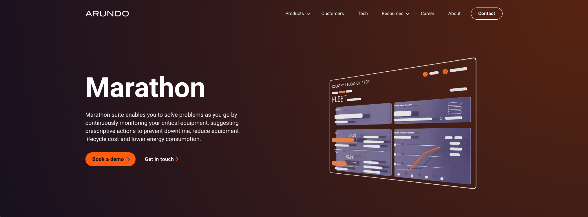
Marathon is an online collaborative platform for energy industry companies to manage their assets and monitor the performance in the field. It detects asset performance anomaly and prevents upcoming failure, achieving great cost saving.
Industry
B2B Data Analytics
Platform
Browser, Tablet (ongoing)
Role
Design Lead, UX Research, QA
Date
2020 - Present
225%
Increase in user engagement
$900,000
Annual revenue per signed client
$15,000
Client savings per failure prevention
Product Definition
|
Product Definition |
I was involved in business decision-making and participated in field research with business partners. I helped decide with the team that the product should focus on supporting crude oil extraction teams, including field engineers and managers, by providing software to monitor live equipment performance and predict potential failures.
Visualize The Workflow
|
Visualize The Workflow |
As the UX designer, I visualize the target user’s workflow and transform their existing processes—originally managed with Excel sheets and legacy software—into a modern, integrated platform.
Essentially, I turned these:


Into this:
I translated the workflow into a design by prioritizing content and arranging it so the reading flow feels natural—from left to right and top to bottom—with higher-priority information presented first. I then tested and iterated the layout using analytics tools to track where users focused, adjusting the arrangement to ensure the most important information is seen first and is clear and simple enough for quick understanding.


Design Handoff And Followup
|
Design Handoff And Followup |
I collaborated closely with the product manager and software engineers in agile sprints, keeping the design consistently one sprint ahead of development. At the start of each dev sprint, I created tasks and subtasks in Atlassian Jira, providing developers with all the necessary details for each screen, including specs and expected behaviors. I maintained open communication to answer questions as they arose and conducted QA checks before any changes were published to ensure they matched the design. After release, we used Hotjar to track user interactions on the application. The new asset page quickly became the most-used page, and a few minor revisions were implemented in subsequent sprints based on observed user behavior.


Design System
|
Design System |
As product scales and UI design trend evolves, we updated our design system as well. Before overhauling the product design system, we updated our marketing / branding styles first. The goal for the design system update was not only to keep up with the UI trends, but also create a cohesive look and feel of the whole suite.

From left to right: old product, new marketing, new product
Overview
The new design system refreshes the product in many ways, from style to usability.
Marathon - before and after adopting the new design system

WCAG Compatible
The design system I created meets WCAG accessibility standards, ensuring all components—colors, typography, and interactions—support a consistent, inclusive, and easily navigable experience for all users.

From Figma to Development
A Kanban board was used to track work progress. It started from Figma to development to design QA and completion.


Retrospective
|
Retrospective |
For startups like Arundo, being able to precisely target user pain points and differentiate ourselves is key. I have had the experience to deal with ambiguity, work with international colleagues around time difference, and everything else that drove me towards a better designer. Marathon is now a rising service in the equipment analytics market serving multiple clients.
